Purpose & Key Persona
Why Redesign Canadasbabystore.com?
- So customers can shop on any device
- To keep your customers happy
- To stand out from the competition
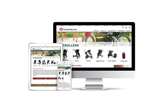
It is important to have a responsive website, meaning it should work on ALL digital devices. The current site looks the same on a mobile as a desktop which is not user friendly or legible.
Optimizing the online user experience makes customers happy. Happy customers are more likely to stay, browse and make a purchase.
There are many other sites that sell baby products. Creating an easy and efficient browsing and buying experience is one great way to stand out from the crowd.
Key Persona
Name: Jen
Gender: F
Nationality: Canadian
Location: Toronto, Canada
Education: Bachelor of Education
Income: $60K
Interests: Family, health, lifestyle, exercise
Tech Skill: Intermediate
Main Online Activities: Email, social media, shopping, research
Jen is a teacher and is expecting her first child. While shopping for baby products, she is mostly concerned about safety and cost. She enjoys shopping online because it saves her time.

Key Research
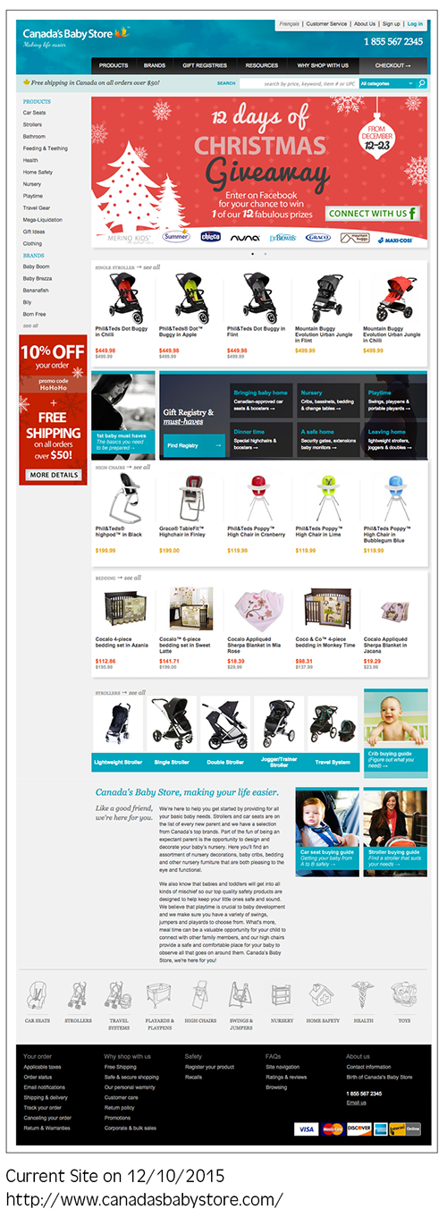
After evaluating the current Canada’s Baby Store site, some of the major usability problems were identified as follows:
- Readability
- Side Column
- Product Size
- Visual Clutter
Areas with white text on dark backgrounds are difficult to read.
Side column with the repeated navigation and bright promo-ad is taking up valuable space on the site. This contributes to the white noise and is distracting.
Product images are too small.
Very little white space, which makes the site look cluttered and overwhelming.
Pros of the Current Site
- Neatly organized with nice design elements/icons
- Clear cart and checkout process
Cons of the Current Site
- Confusing user experience elements and visual clutter
- Lack of a strong brand (look and feel)
Competitive Audit
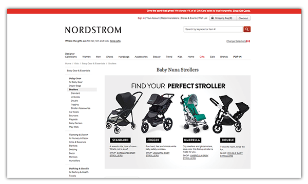
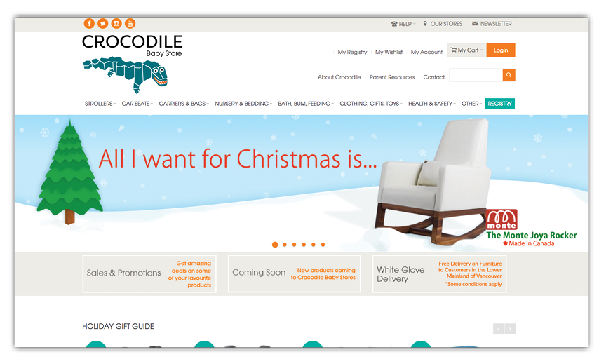
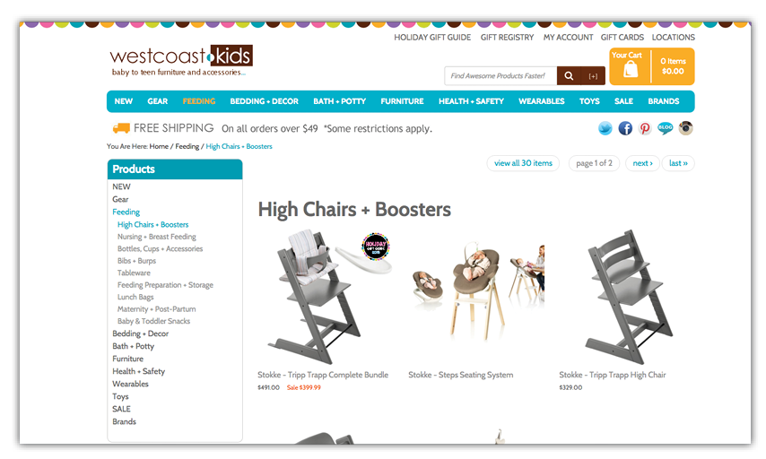
There are many ecommerce sites that sell baby products. I identified several of the top competitors who had sites that were both visually appealing and easy to navigate. The elements that contributed to the success of these website designs were that they had:
- Clear and organized navigation
- Ample white space
- Large product images
- Bright abd playful color schemes
Redesign Direction
Based on the Key Research and Competitive Audit, I focused on the following design goals when designing the initial schematics:
- Organize the navigation and omit the side column
- Reduce the visual clutter and add more white space
- Increase the product image size
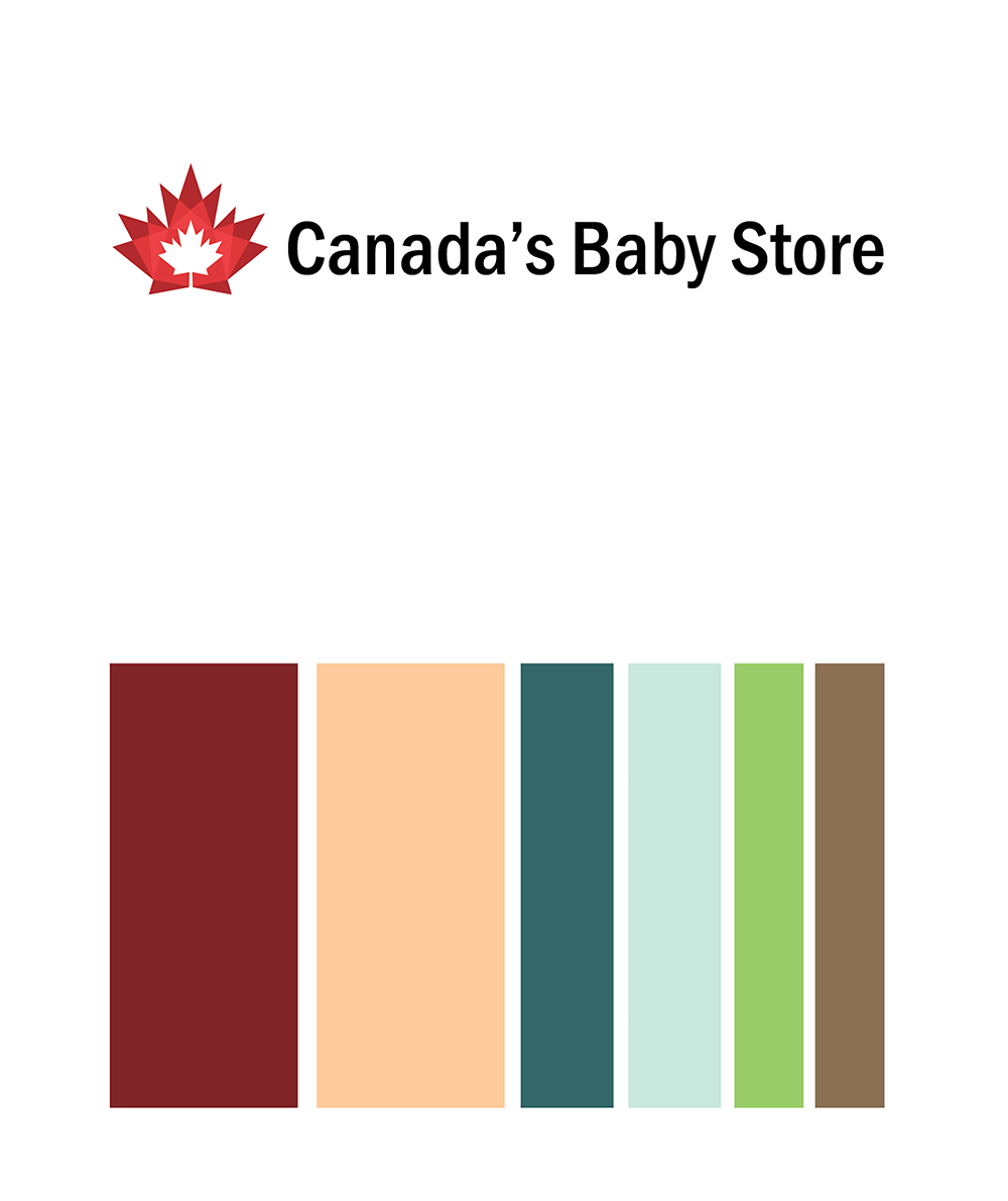
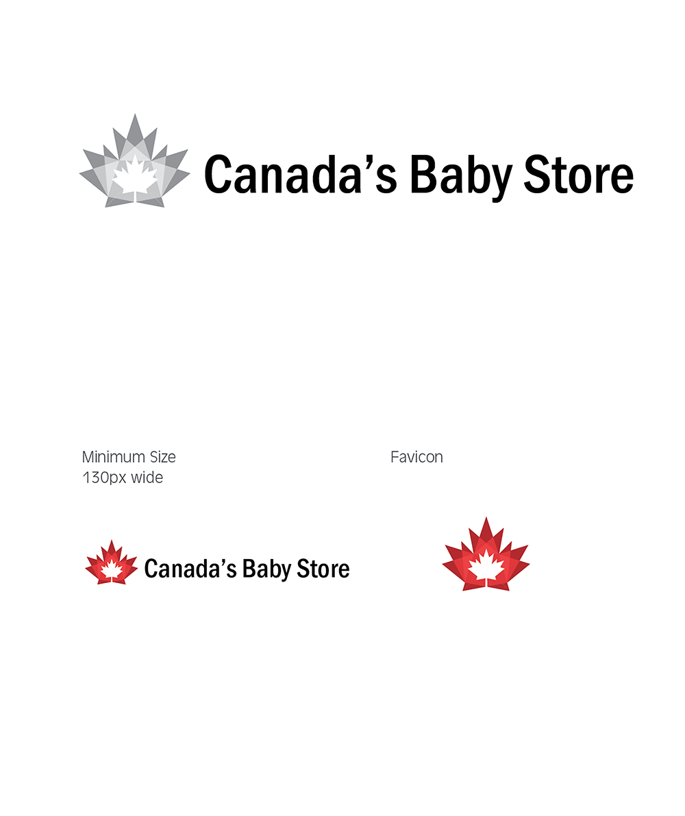
- Create a stronger look and feel for the site with a new logo, appropriate color scheme and playful graphics
- Address the readability concerns by ensuring a minimum text size of 16px with appropriate spacing
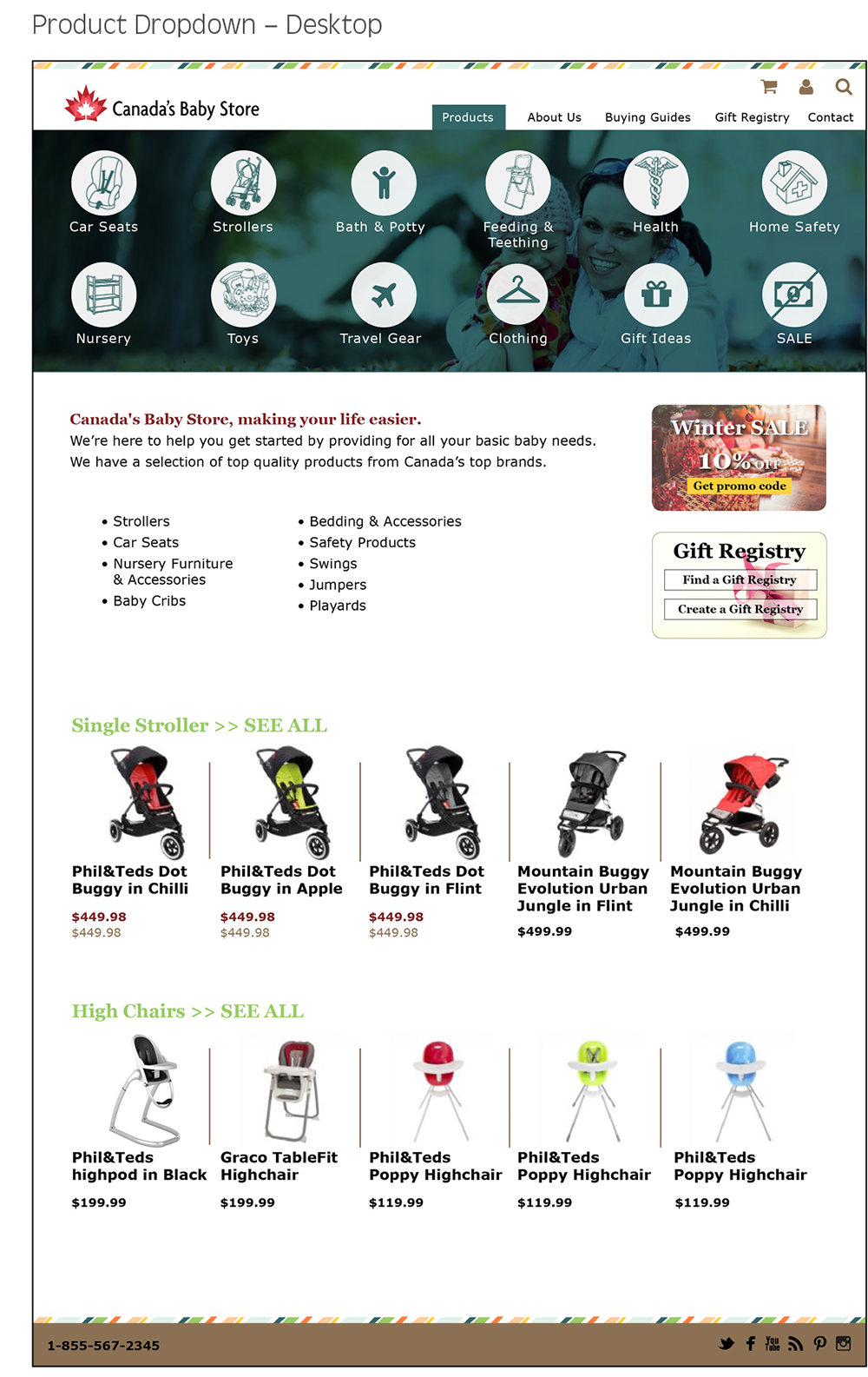
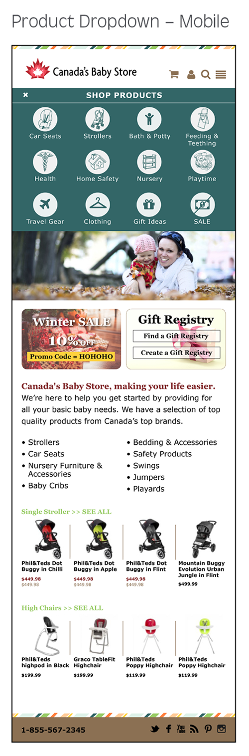
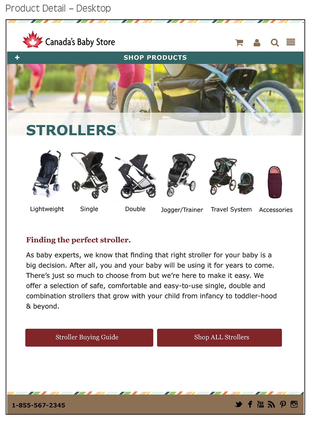
- Product categories appear as icons
- Feature products and prices added to home page for accelerated shopping
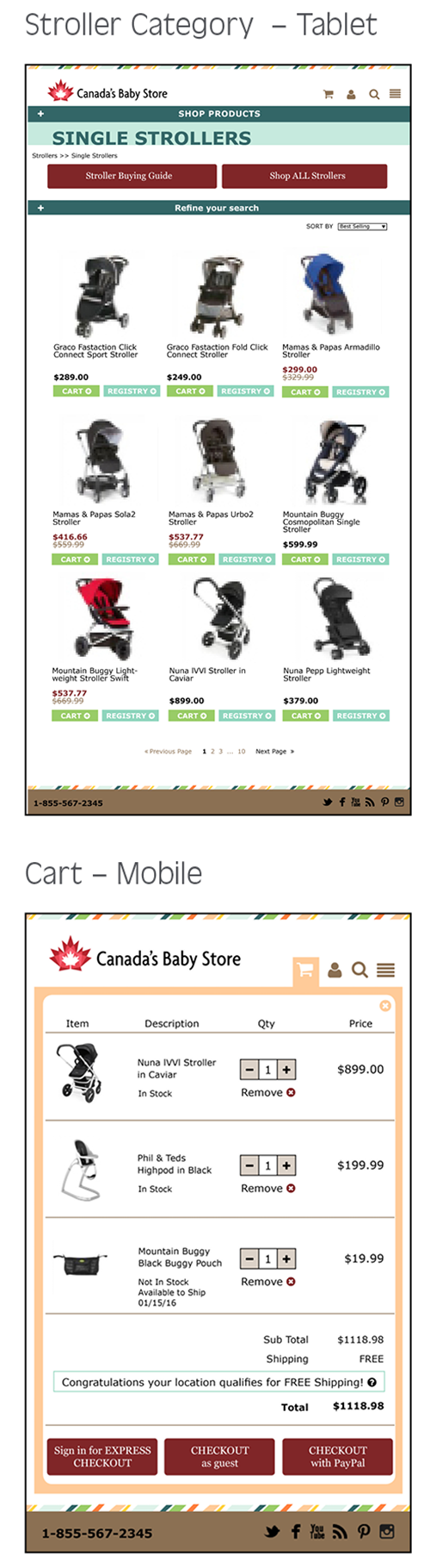
- Product index includes: name, price, add to cart/registry buttons
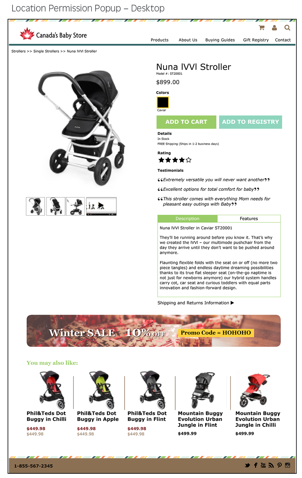
- Product images in “You may also like” section are proportional to product detail images
- Product detail page includes Description and Features only. Ratings appear as stars and Shipping and Return info become links
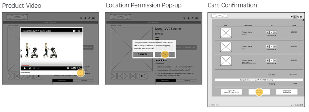
- Location permission pop-up added so the site can give a shipping estimate at the cart confirmation before users input their address
Visual Design
Information Architecture
Workflow for Redesign
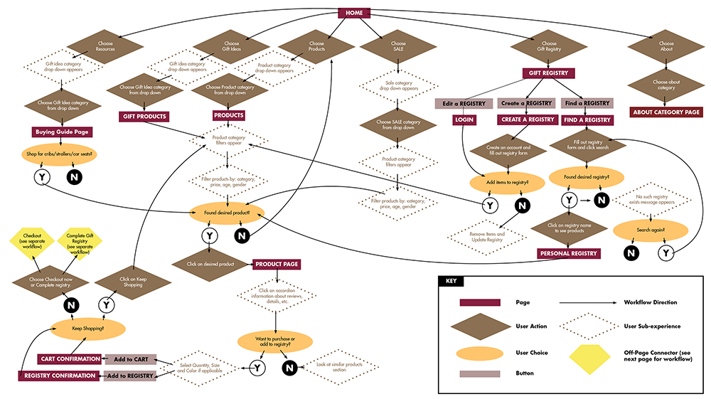
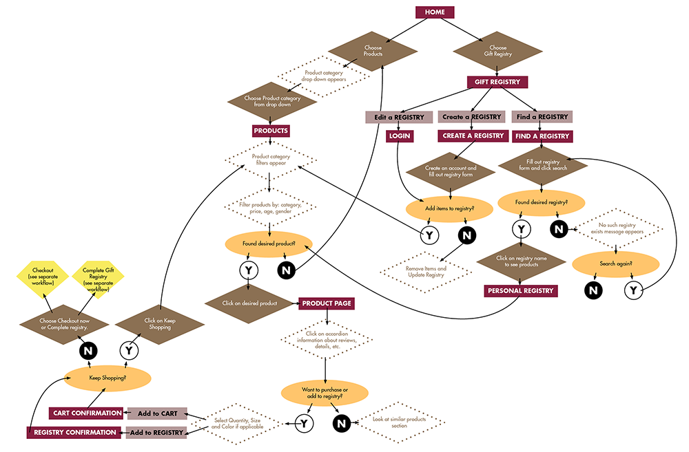
Workflow – Products and Registry
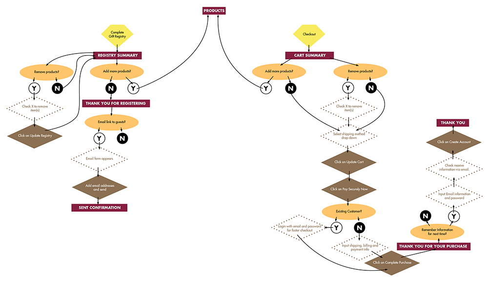
Workflow – Checkout and Registry
User Tasks
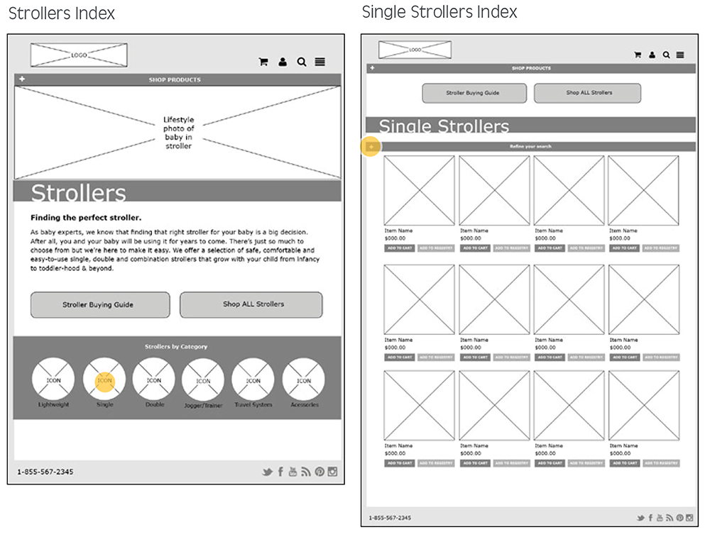
Find the selection of Single Strollers without using the search bar

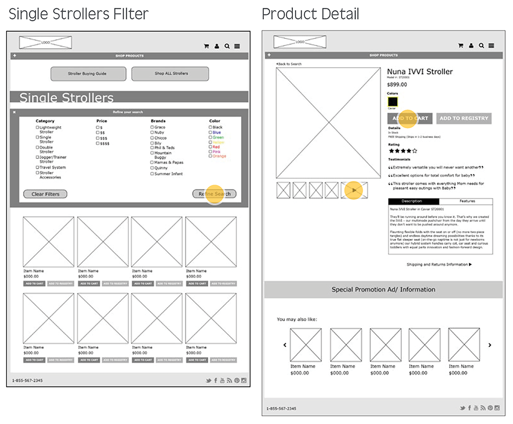
Find the Nuna IVVI Stroller add it to the Cart
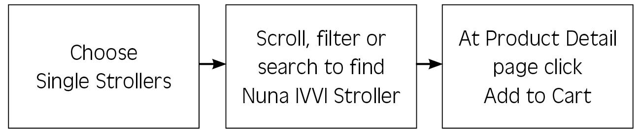
Find the selection of Single Strollers without using the search bar

Find the selection of Single Strollers without using the search bar

Wireframes
User Task 1 – Find the selection of Single Strollers without using the search bar
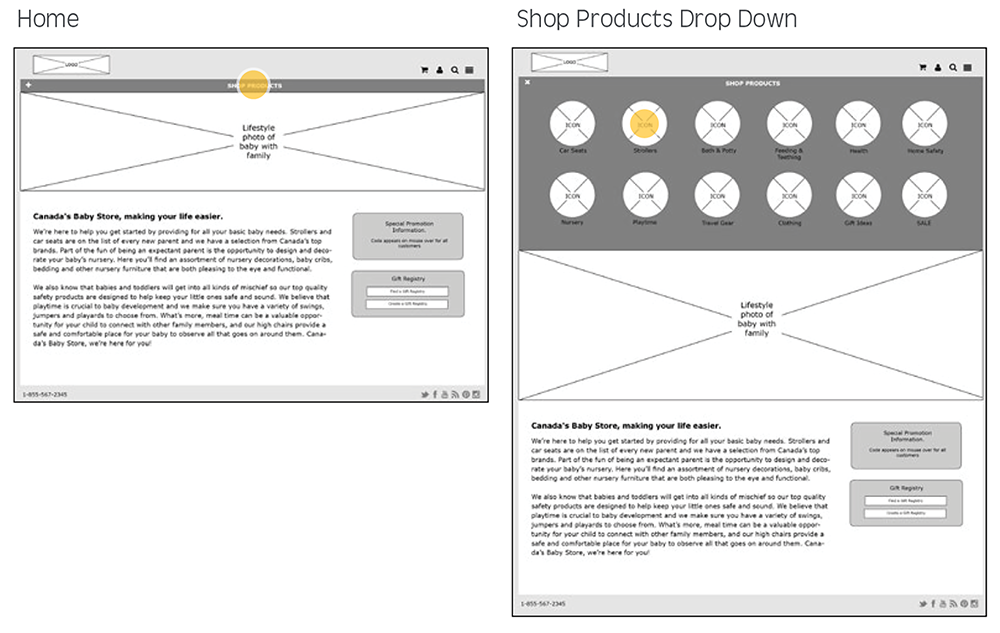
User Task 2 – In the Single Stroller section, find the Nuna IVVI Stroller and add it to the Cart
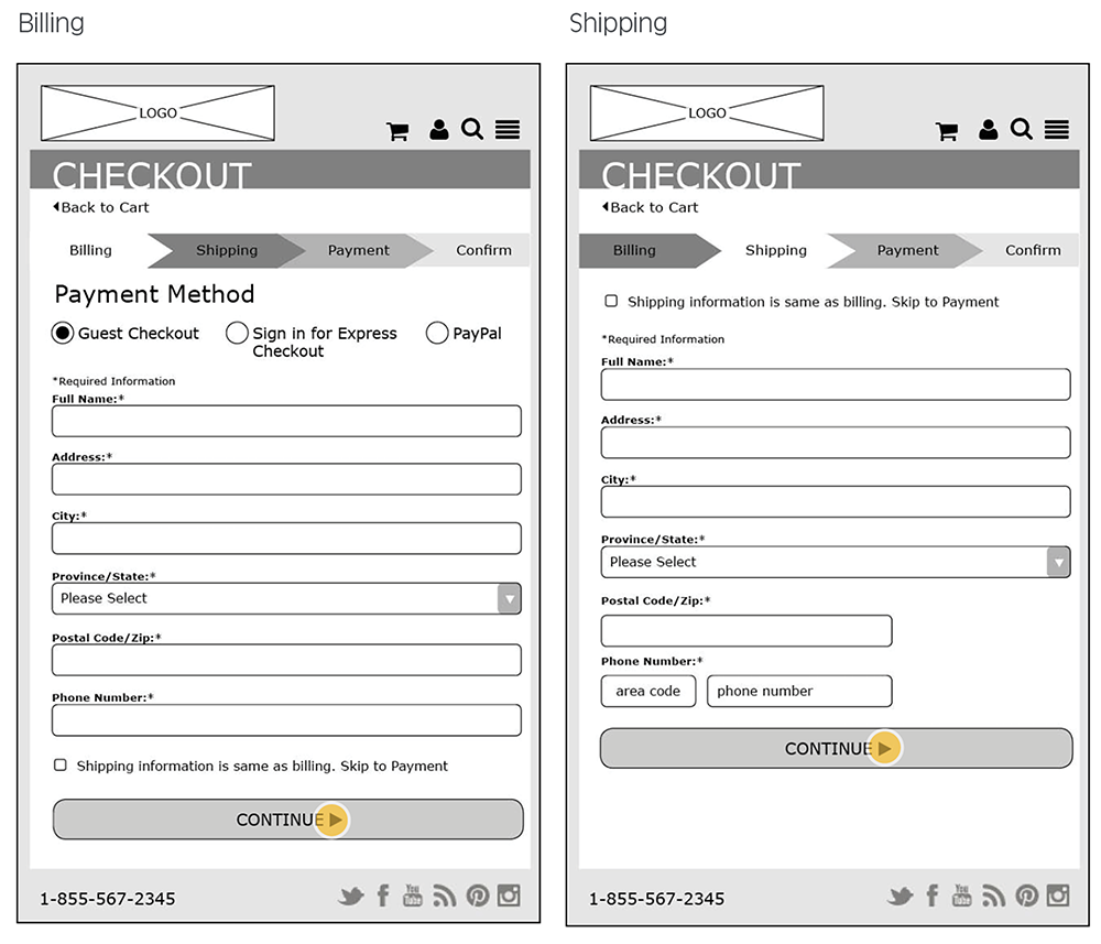
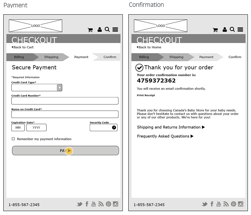
User Task 3 – Proceed through Checkout
User Task 4 – Create a Registry
High Fidelity Page Features
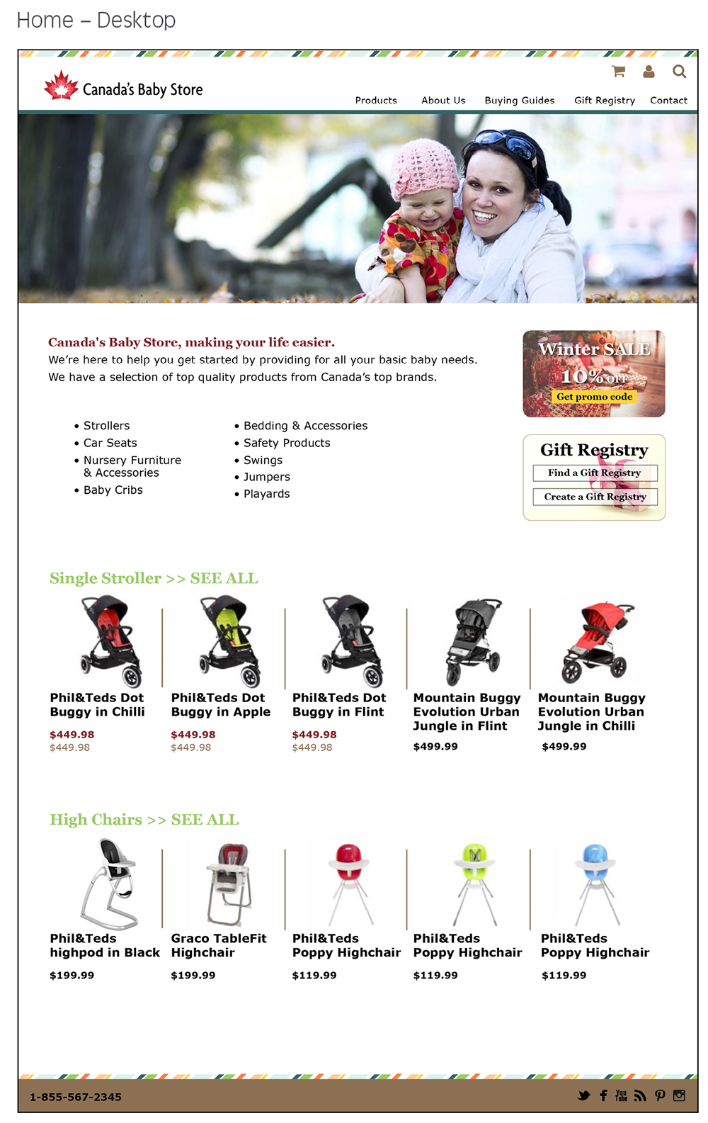
Home & Navigation
- Text has been reduced for easy scanning
- Product icons help users quickly find their desired section
- Feature product images are shown across the bottom with prices for quick browsing
- Search, Sign In and Cart are always accessible from any page
Product & Category Index
- Stroller categories are high on the page and images help users visualize
- Copy is brief and concise
- Page title is clear
- Products can be easily sorted and filtered
Product Detail
- Large product photos on all devices
- If a user stays on the page for at least 30 seconds, a location pop-up appears asking them permission to use their location to calculate shipping costs
- Video is enlarged as pop up when thumbnail is clicked
- “You may also like” section makes suggestions and encourages further shopping
- Promo code is visible to all users
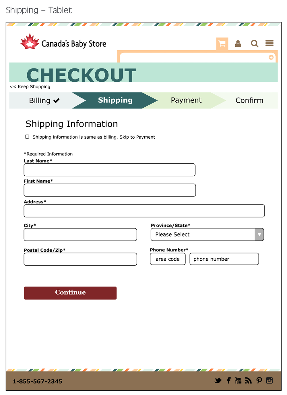
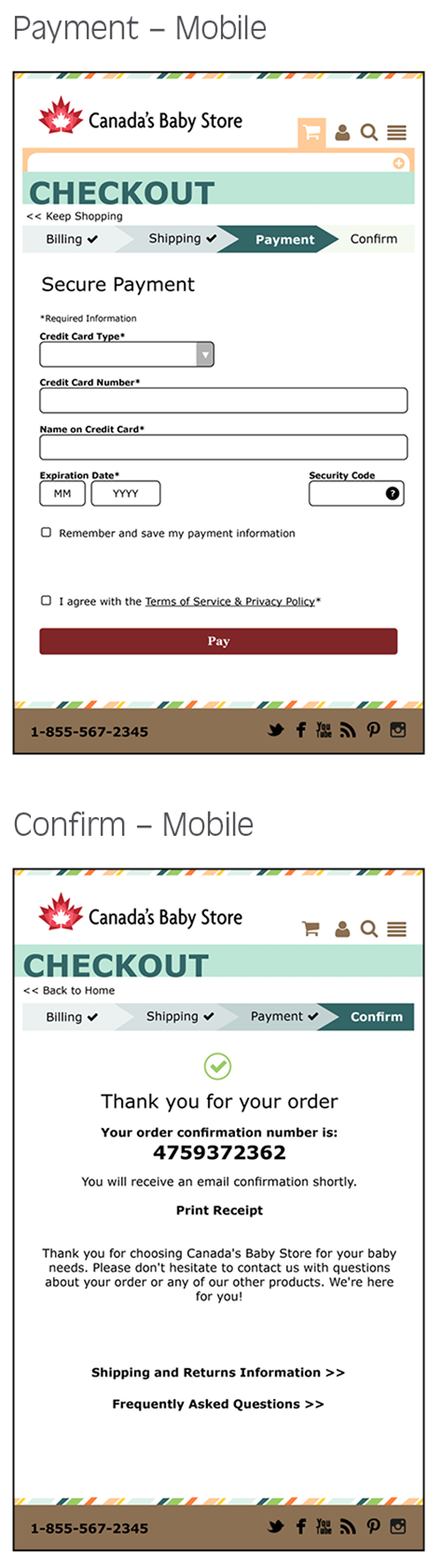
Checkout
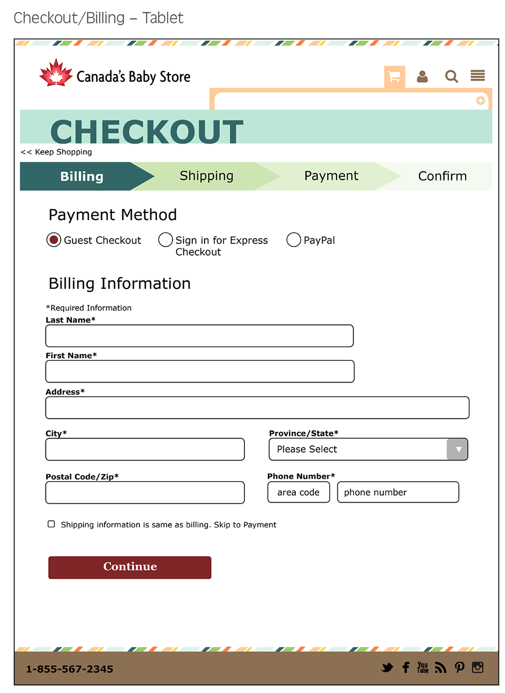
- Cart Confirmation is visible when user first enters checkout, then minimizes after a few seconds. This allows access to the order details throughout the checkout flow (except confirmation page)
- Input fields are clear
- Clickable progress bar shows current step
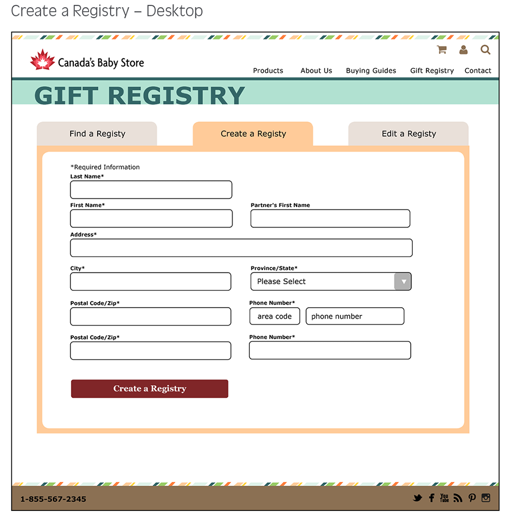
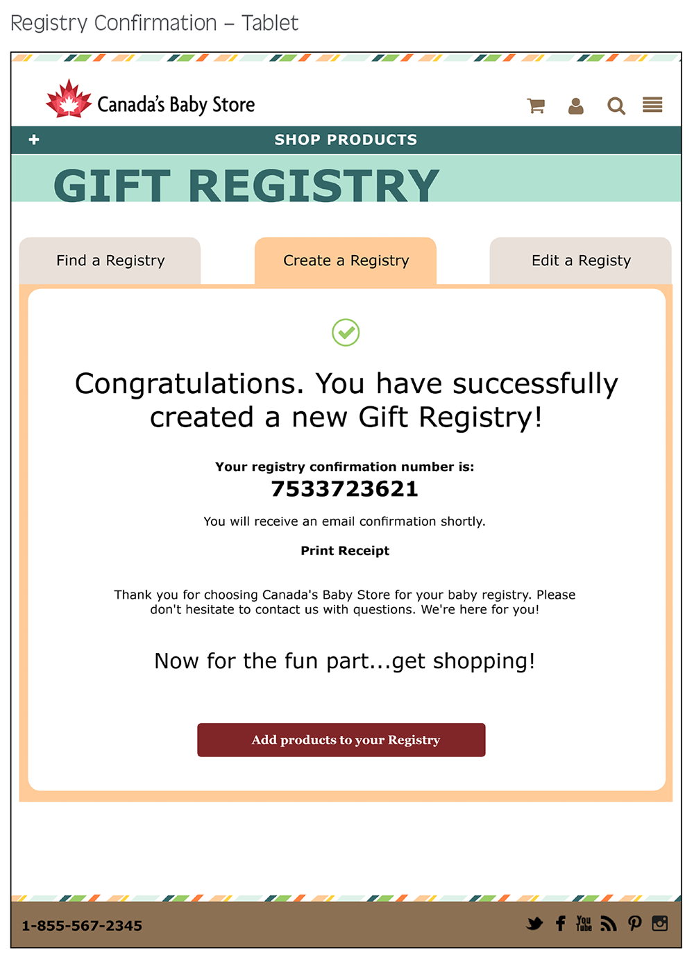
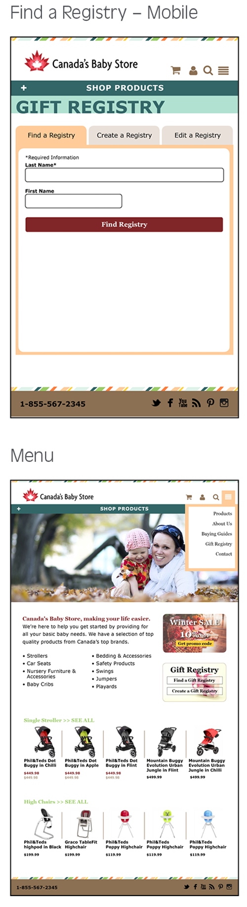
Gift Registry
- Tabs make it easy to navigate to different forms
- Large, straight-forward text input fields
- Page title is clear
- Prompts help users add items to registry once the registry is created
UX/UI Design
User Testing
To test the effectiveness of the design, a prototype was created using and tested using a survey created with SurveyMonkey. The survey asked users to perform several tasks on the prototype and answer questions about their experience.
Tester Profiles
My user testers were 25 men and women between the ages of 25 and 45. Half were shown design A and the other half design B
A/B Test
Two main features of the site were tested using an A/B test.
The “Gift Registry” button on the home page – does the button help users find the Create a Gift section?
RESULT
Yes, the “Gift Registry button helps.
A/B Test
Two main features of the site were tested using an A/B test.
The placement of the Stroller Category Links – can the user find the section easier if the categories are higher on the page?
RESULT
Yes, the categrories should be higher.
Other Results
- Most of the women participants read the text on the home and product pages and felt it added to the site while most of the male participants skimmed past it.
- Half of the participants added the product to the cart from the index page and the other half from the detailed page
- There were not any drastic differences in usability between devices. Answers from participants who completed the survey on more than one device remained consistent
- Feedback suggested that once an item is added to the cart, the page should scroll to the top of the page to reveal the cart